

Measuring the impact of the app screenshots in Google Play and how it affects the overall downloads amount
How to improve the store conversion rate of your app by adding beautiful and meaningful screenshots


In this article I want to show you a little A/B test I have done recently in one of my apps regarding the impact that the app screenshots have on the store conversion rate.
If you have ever read about app marketing, how to boost your downloads, how to improve the ratio of store listing visitors that download your app, etc; I'm pretty sure that you've already read that one of the key aspects of this process is to enhance the screenshots of your app that are presented to your potential users in your store page.
Although it seems logical advice, this time I wanted to perform an A/B test by myself to truly re-assert this; because I think that the most valuable knowledge is the one that has been acquired by your own experience, the one that you have seen with your eyes and the one that you can ultimately trust. Reading suggestions and tips in videos, blogs, and books is great; but the amount of information that we have nowadays is enormous and sometimes contradictory, this is the reason why I always prefer to test all the stuff that I read by myself.
The test
The app in question is called Weight Tracker, it's a small and simple app which purpose is to allow the user to track their weight over time. The idea is to weigh yourself regularly, and add the measured value to the app; then you will see some progress graphs and other useful info to let you know how well (or bad) your diet plan is working.
Originally I like to add the minimum amount of features needed to the app for work in order to have a shippable MVP in a short time and start grabbing user feedback as soon as possible. This mentality also applies to the store listing, so in this stage I simply take a few screenshots of the app in its current state and I add them to the store page without altering anything.
Once the app starts to mature and evolves and gets out of the MVP stage I start to test different app icons and different screenshots with different designs to see which one fits best. So this time, after creating an enhanced version of the store screenshots, I thought that it would be interesting to add them as an A/B test and compare its performance with the latest screenshots.
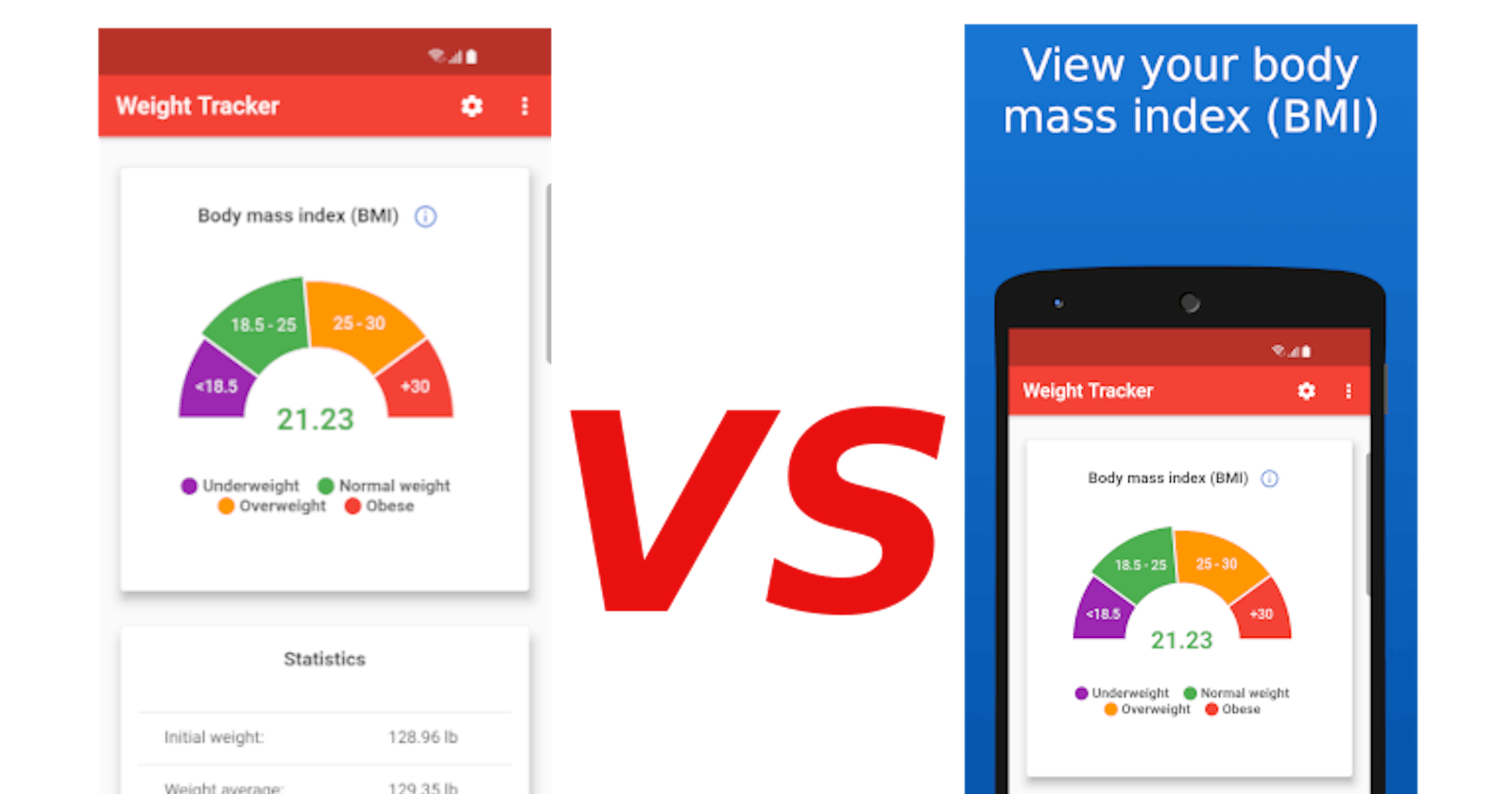
This is the first version of the screenshots:
As I said, a direct screenshot was made of the app. Even with this simple version, the app performed very well in the beginning.
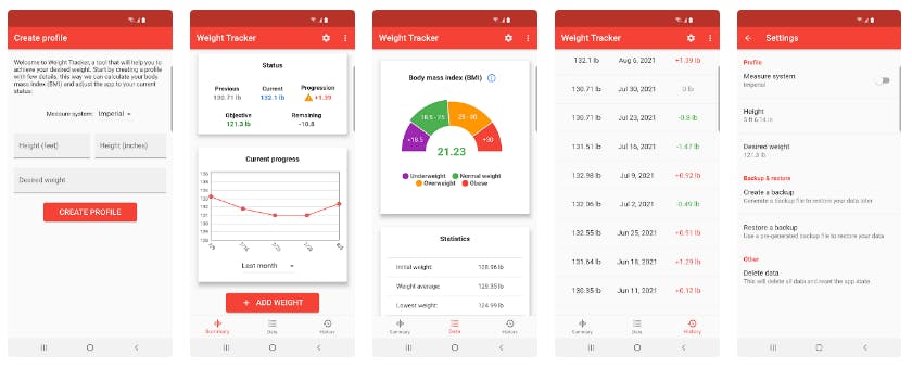
This is the enhanced version:
The app image is basically the same but wrapped with a device frame and with a top label that offers a quick insight of what the app has to offer.
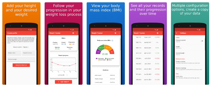
This is how it looks in Google Play and in the Apple's AppStore.
This is just one of the ways to create better app screenshots, other options are playing with the position of the text, the background, the rotation of the elements...etc. I like to apply this one since is simple but yet powerful enough in order to attract new users.
Benchmarking both versions
I have used the A/B test feature on Google Play to compare how well each version works. If you don't know what this feature is, it basically lets you add up to 4 versions of different store listing resources, like the short and long description, the app icon, the app screenshots... and Google Play will display all versions uniformly and collect data to let you know which one works best. It's a powerful feature to boost your conversion rate and I suggest you to start using it right now if you are not doing it yet.
I have let this test last for two weeks, for normal A/B tests this is insufficient to obtain clear results; but this is just a small demonstration experiment and I already know which version is better, so no need to continue with it.
The results of the experiment:
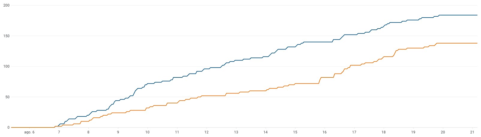
The orange line is the one with the pure screenshots, the old one. The blue line is the new version with the enhanced screenshots.
Conclusions
The conclusion is clear: creating a more sophisticated version of the app screenshots, one with a simple label explaining the features of the app, drives to more downloads.
As I said at the beginning of the article, the best way to approach these changes is by doing some tests, the A/B test feature of Google Play is one tool to do so but it's not the only one, there are other tools out there that allows you to create different versions of different resources to check which one is better.
This same approach also applies to the in-app factors, A/B testing features or layouts within your app is another way to improve other important KPIs of your app, like the monetization conversion or others.
Another interesting fact that I have seen in my tests is that while changes in visuals (app icon, app screenshots, featured graphic) do show a huge change; changes in the store texts have a lower impact. So focusing on providing strong graphical designs are key.
That's all for today, thanks for reading!